-
The place to go for fries tossed to perfection
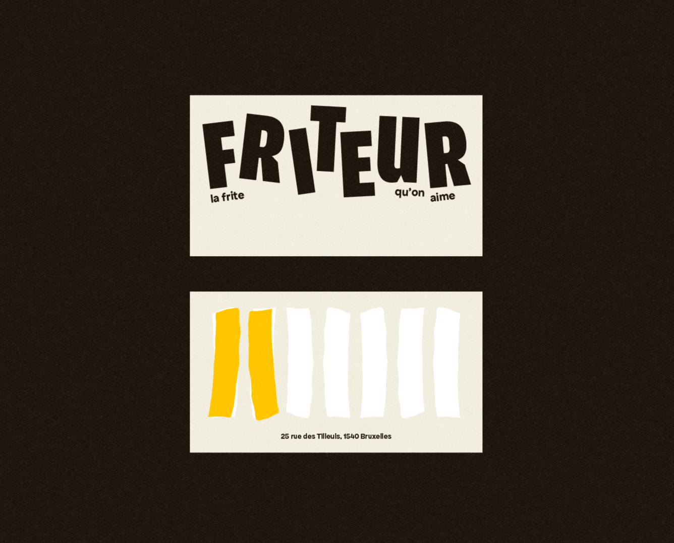
Friteur is the kind of place you don’t forget. Family-owned, full of charm, and home to what might just be the best fries in town. Locals grow up on these fries. Tourists find them once and come back the next day. Thick, golden, crispy on the outside, fluffy on the inside. Tossed the proper way, served with a smile, and eaten with your fingers. Just like it should be.
The brand looks just like the place feels. Warm, welcoming, and a little cheeky. The logo represents fries mid-toss, a nod to the joyful chaos behind the counter. The illustrations are hand-drawn and full of character. Like the fries, they’re thick, bold, and full of flavor.
Friteur isn’t trying to be fancy. It’s just really good at being Friteur. And that’s what makes it special.
-
Design Annaëlle Quionquion
Illustrations Annaëlle Quionquion
Copy Annaëlle Quionquion
Brief requestor Designer Briefs