-
The warmth of authentic Vietnamese cuisine
Authentic, warm, and full of flavor, it’s the go-to spot when you don’t feel like cooking but still want something that feels homemade. Whether you're grabbing a quick lunch or sitting down for comfort in a bowl, Nôm delivers the kind of food that hits the spot.
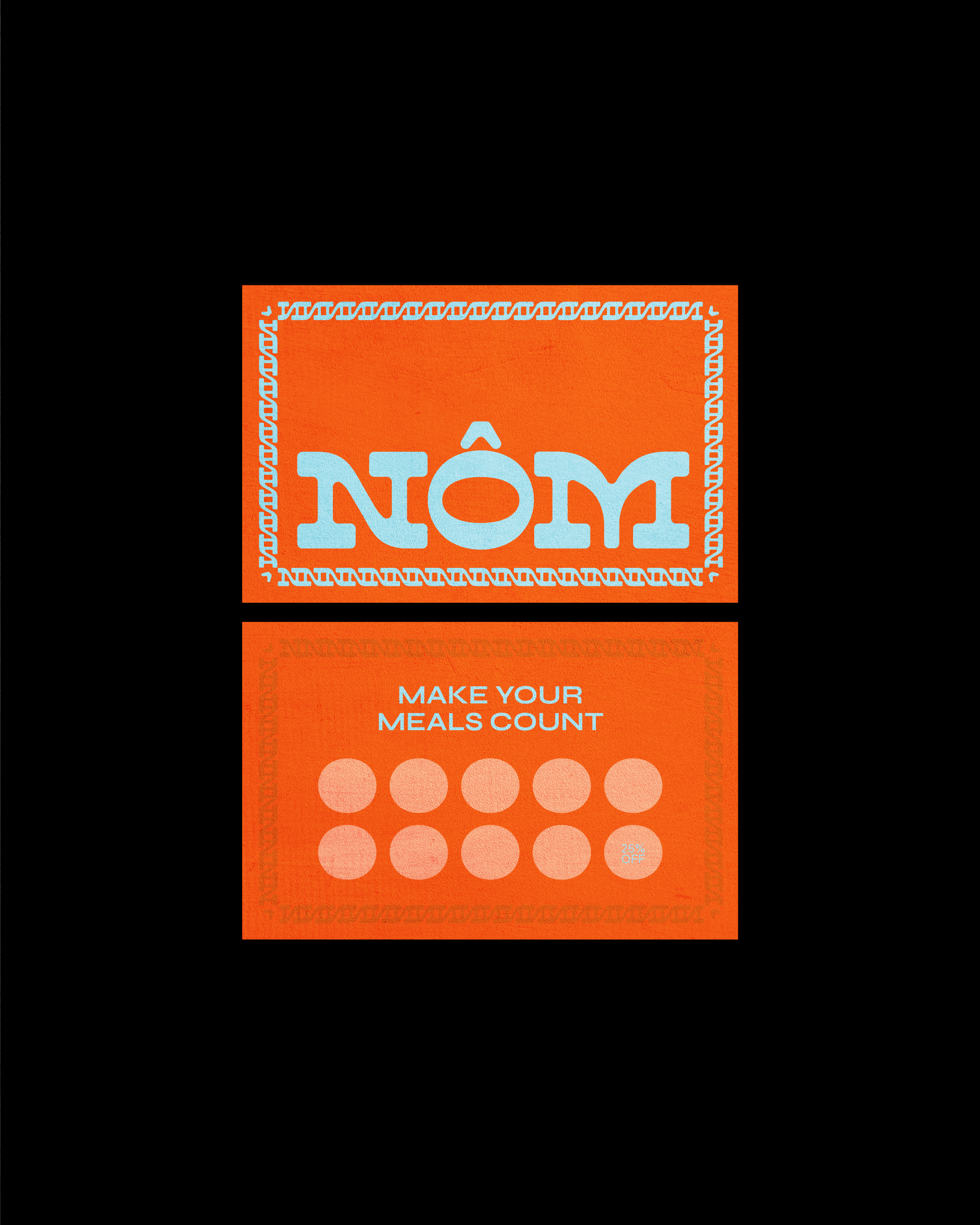
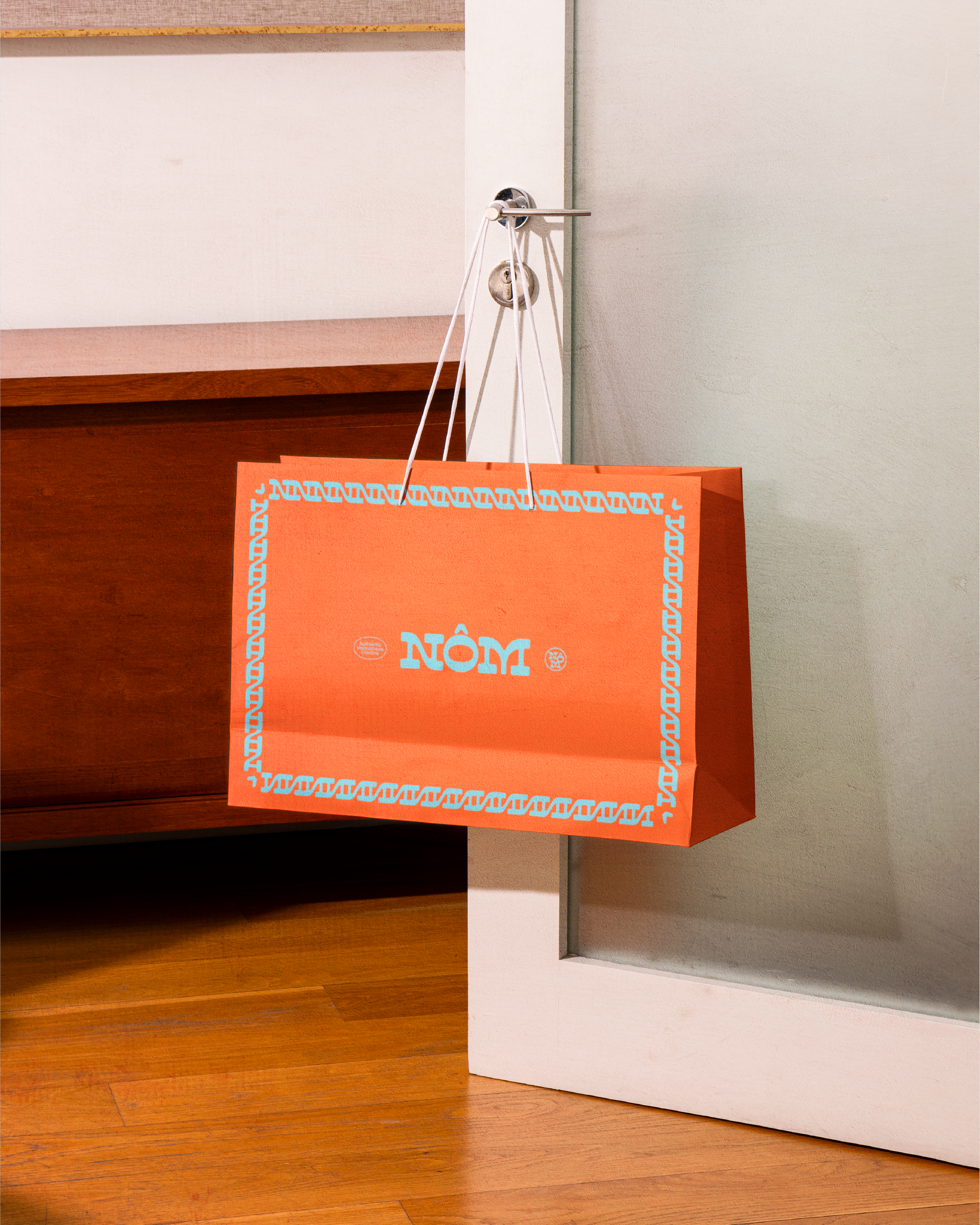
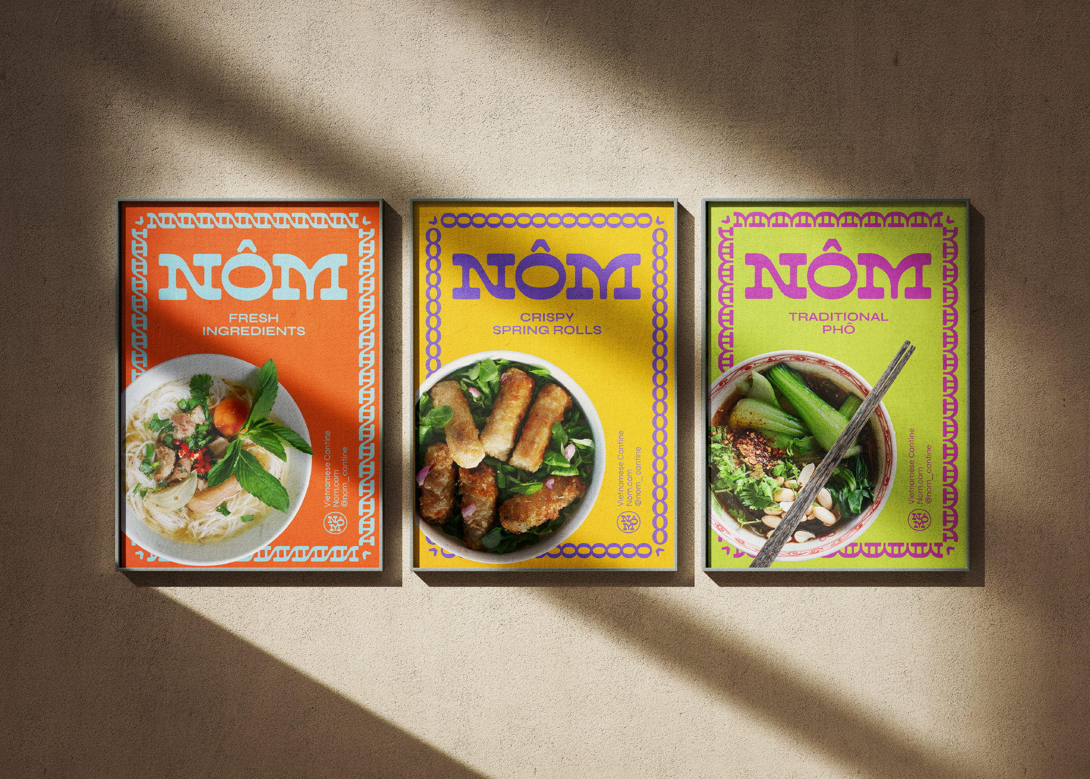
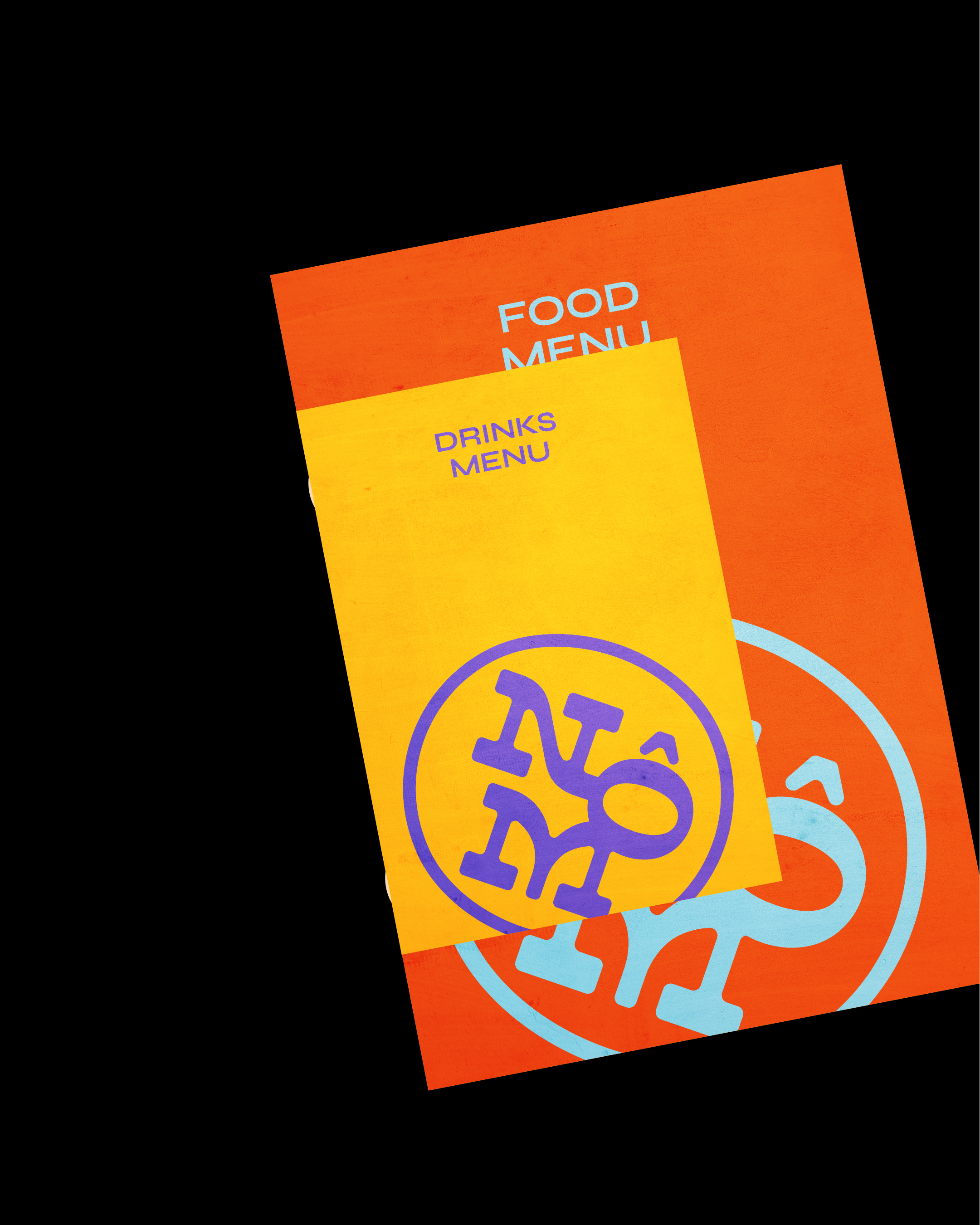
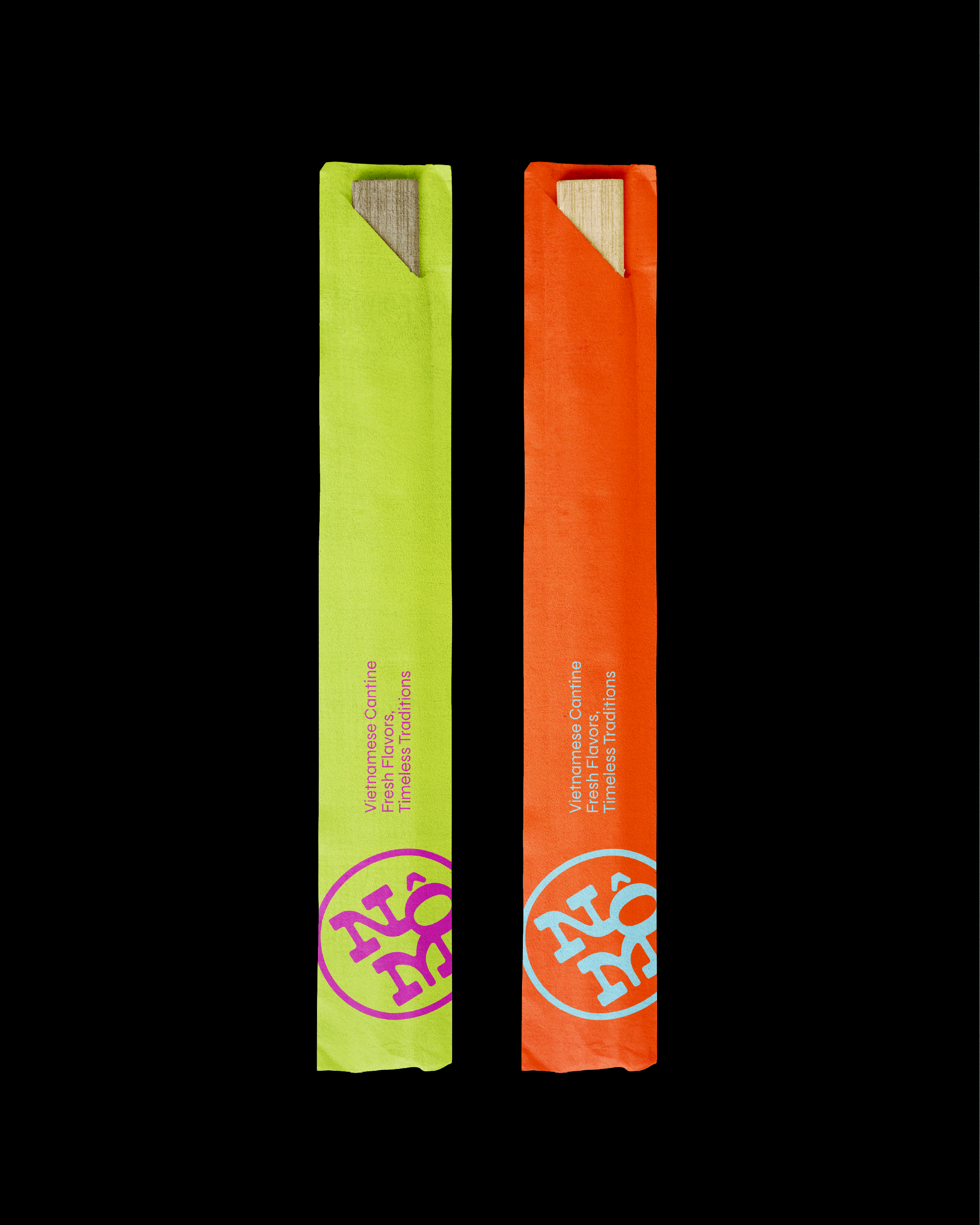
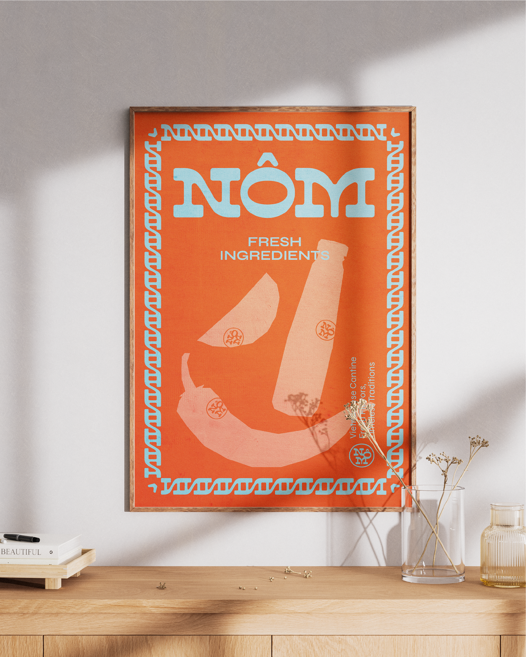
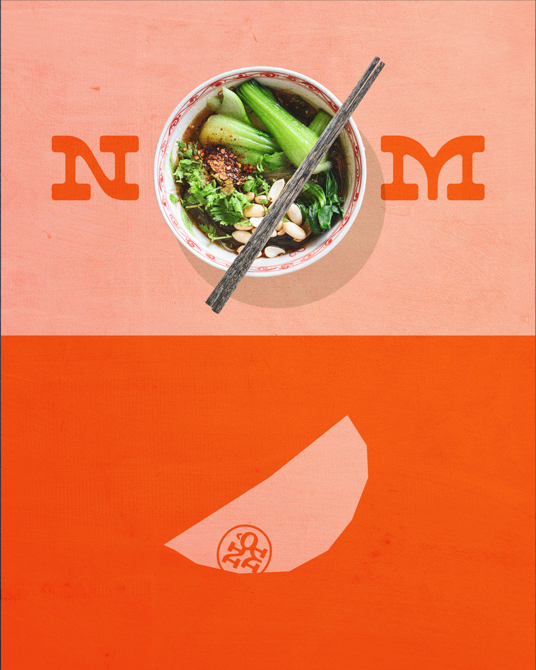
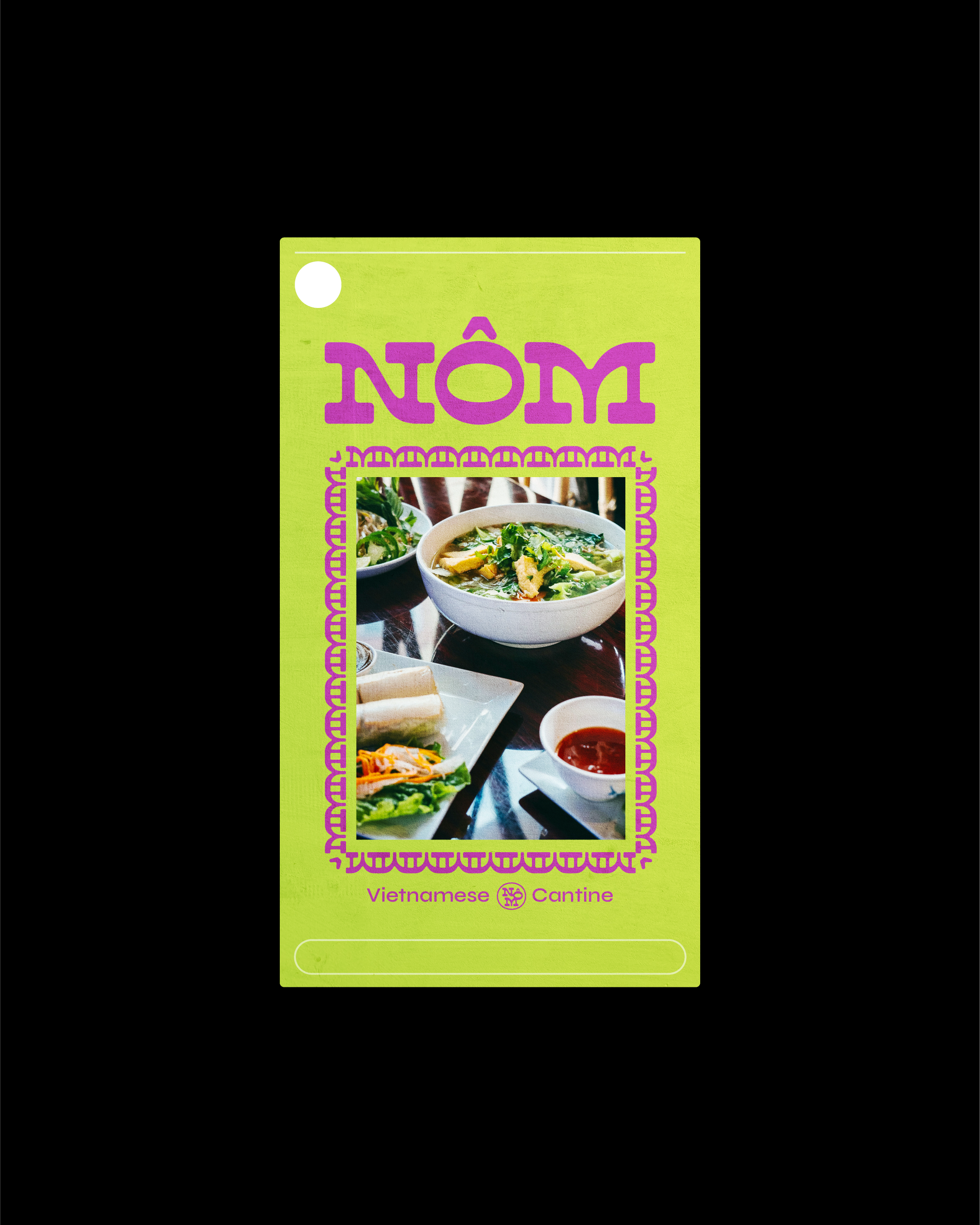
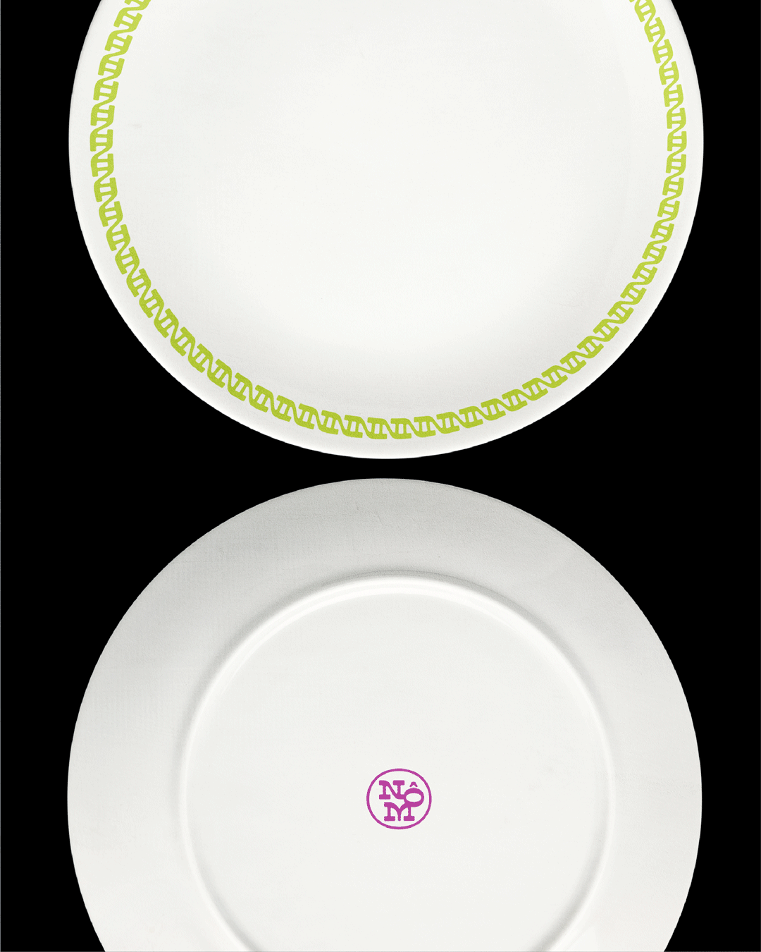
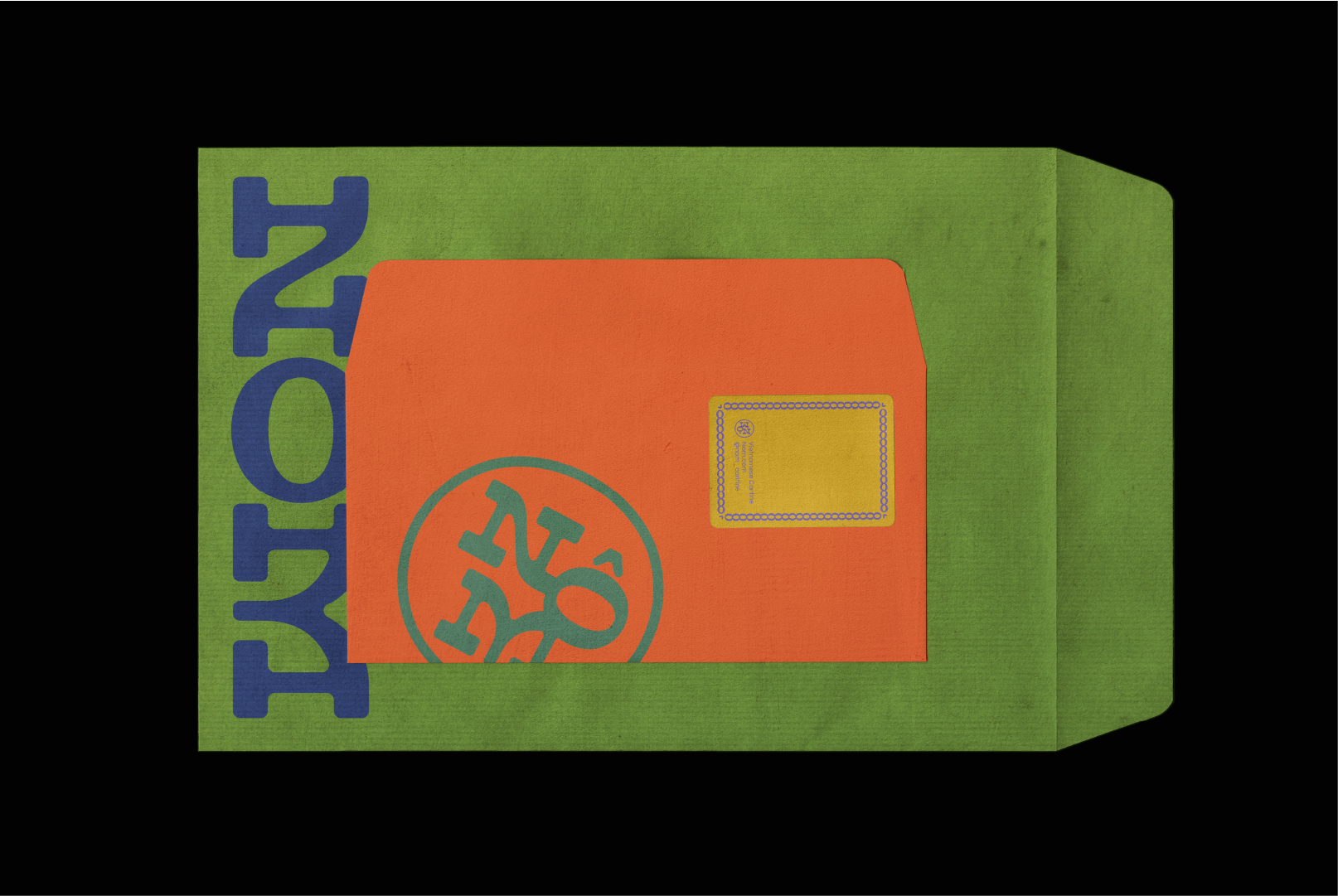
The brand identity reflects that same comfort. The color palette is warm and inviting, inspired by the richness of the dishes themselves. It feels like home, but with a fresh, modern edge.
Design-wise, the frame is what brings it all together. Built from the letters of the logo, this graphic element acts as a visual container for the food: highlighting dishes, guiding layouts, and making the brand instantly recognizable. It’s simple, smart, and lets the food shine.
Nôm is not trying to be flashy. It’s familiar, reliable, and always satisfying. The kind of place that becomes part of your routine without even trying.
-
Design Annaëlle Quionquion
Copy Annaëlle Quionquion
Brief requestor Designer Briefs